
Table of content
Chip UI components help to enter information, add filters, or trigger action in our application. There are many chip types, but today we are showing you filter chip. Filter chip helps to filter the content based on selected chip value/attribute. Given content can use multiple filters at a time. But for learning purposes, we are using one filter at a time to a given to-do list.
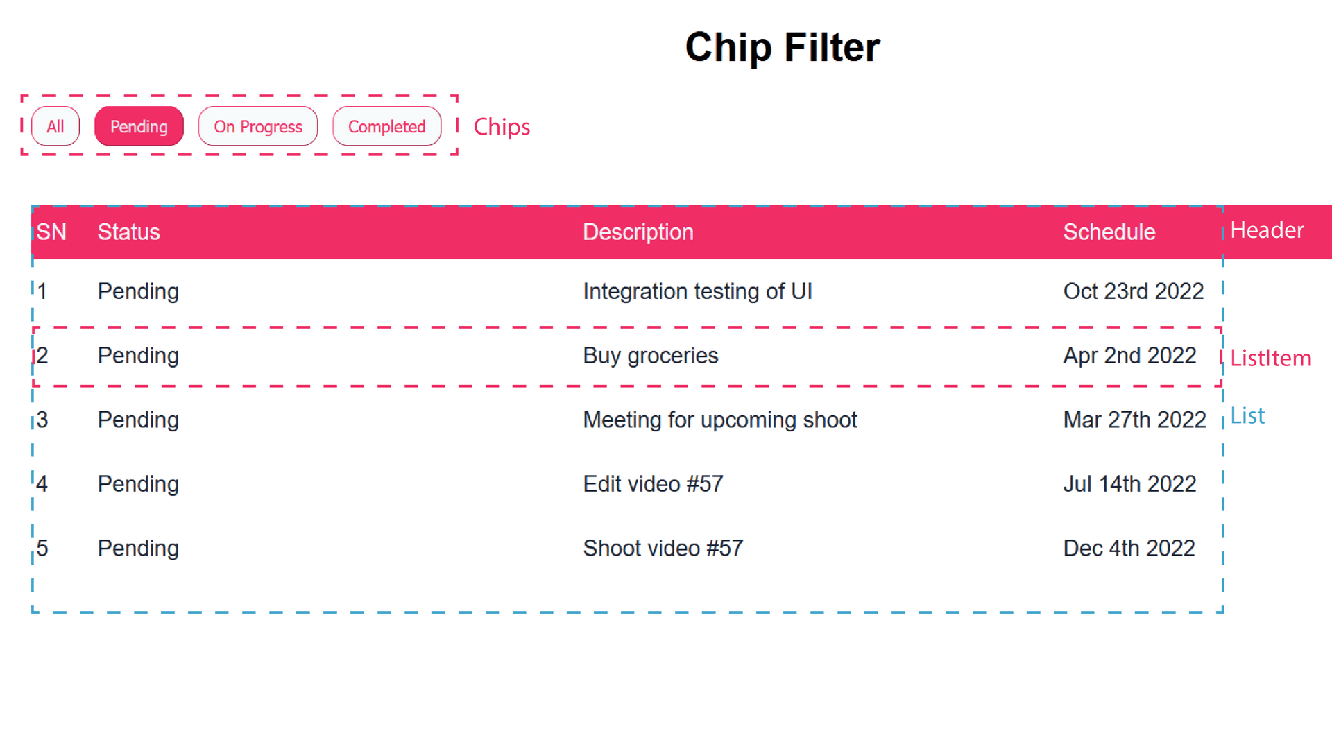
Below we can see our React project structure. We have filter chips based on the status of our to-do list. We want to filter the to-do list when we select a filter chip. Mainly there are three component in this React project.
- Filter Chip Component
- ListItem Component
- List Component

Preparation
In the src folder, create a components folder.
dummyData.json
In the src folder of your React project, create a dummyData.json file. It will have an array of dummy data representing a to-do list with its current status, description and schedule. Copy the below data in the dummyData.json file.
1[
2	{
3		"status": "pending",
4		"status_label": "Pending",
5		"desc": "Integration testing of UI",
6		"schedule": "2022-10-22T16:02:41Z"
7	},
8	{
9		"status": "completed",
10		"status_label": "Completed",
11		"desc": "Publish new blog post",
12		"schedule": "2022-10-02T00:30:36Z"
13	},
14	{
15		"status": "on_progress",
16		"status_label": "On Progress",
17		"desc": "Shoot for youtube video",
18		"schedule": "2022-05-10T19:32:37Z"
19	},
20	{
21		"status": "pending",
22		"status_label": "Pending",
23		"desc": "Buy groceries",
24		"schedule": "2022-04-01T16:49:55Z"
25	},
26	{
27		"status": "on_progress",
28		"status_label": "On Progress",
29		"desc": "Write email for sponsership",
30		"schedule": "2022-09-28T07:41:27Z"
31	},
32	{
33		"status": "pending",
34		"status_label": "Pending",
35		"desc": "Meeting for upcoming shoot",
36		"schedule": "2022-03-26T23:10:29Z"
37	},
38	{
39		"status": "on_progress",
40		"status_label": "On Progress",
41		"desc": "Review edited video #56",
42		"schedule": "2022-02-21T10:09:07Z"
43	},
44	{
45		"status": "pending",
46		"status_label": "Pending",
47		"desc": "Edit video #57",
48		"schedule": "2022-07-14T07:15:59Z"
49	},
50	{
51		"status": "pending",
52		"status_label": "Pending",
53		"desc": "Shoot video #57",
54		"schedule": "2022-12-04T03:58:19Z"
55	},
56	{
57		"status": "completed",
58		"status_label": "Completed",
59		"desc": "Write script for video#57",
60		"schedule": "2022-09-09T10:36:43Z"
61	}
62]
util.js
In the src folder, create a util.js file. There will be two utility functions that will act as an API for our example. fetchTodoList will fetch and return all the list from the dummyData.json file. searchToDoByFilter function will accept a filter attribute and returns the filtered list from the dummyData.json. Below is the code for the util.js file.
1import todoList from "./dummyData.json";
2
3export async function fetchTodoList() {
4	return todoList;
5}
6
7export async function searchToDoByFilter(filter) {
8	if (filter === "all") {
9		return todoList;
10	}
11
12	const filteredTodo = todoList.filter((todo) => {
13		if (filter === todo.status) {
14			return todo;
15		}
16	});
17
18	return filteredTodo;
19}
App.js
- In App.js file we will have a list of to-do items. Then we will add pre-defined row of filter chips. These chips will help to filter out the to-do items.
hitsstate will hold all the list of filtered to-do items.selectedFilterstate will hold the value of currently selected filter.- Below is the code for the App.js file.
1import { useState, useEffect } from "react";
2
3import "./styles.css";
4import { fetchTodoList, searchToDoByFilter } from "./util";
5
6export default function App() {
7	const [hits, setHits] = useState();
8
9	const filters = [
10		{ label: "All", value: "all" },
11		{ label: "Pending", value: "pending" },
12		{ label: "On Progress", value: "on_progress" },
13		{ label: "Completed", value: "completed" },
14	];
15
16	const [selectedFilter, setSelectedFilter] = useState({
17		label: "All",
18		value: "all",
19	});
20
21	useEffect(() => {
22		const getTodoList = async () => {
23			const data = await fetchTodoList();
24			setHits(data);
25		};
26
27		if (selectedFilter.value === "all") {
28			getTodoList();
29		}
30	}, [selectedFilter]);
31
32	const filterByChips = async (filter) => {
33		const data = await searchToDoByFilter(filter.value);
34		setSelectedFilter(filter);
35		setHits(data);
36	};
37
38	return (
39		<div className="App">
40			<h1>Filter Chip</h1>
41			// filter chips
42			<section className="filterContainer">
43				{filters.map((filter) => (
44					<button
45						key={filter.value}
46						className={`filter ${
47							selectedFilter.value === filter.value ? "selectedFilter" : "unselectedFilter"
48						}`}
49						onClick={() => filterByChips({ label: filter.label, value: filter.value })}
50					>
51						{filter.label}
52					</button>
53				))}
54			</section>
55		</div>
56	);
57}
Styling App.js
- Below is the code for the styles.css file.
1.App {
2	font-family: sans-serif;
3	text-align: center;
4}
5
6.filterContainer {
7	display: flex;
8	flex-direction: row;
9	height: 4rem;
10	gap: 0.75rem;
11	margin-left: 1.5rem;
12	margin-right: 1.5rem;
13	margin-top: 1rem;
14	margin-bottom: 1rem;
15	overflow-x: scroll;
16	color: #f8fafc;
17}
18
19.filter {
20	background-color: #f8fafc;
21	border-width: 1px;
22	border-color: #f02e65;
23	border-radius: 0.75rem;
24	padding-left: 0.75rem;
25	padding-right: 0.75rem;
26	margin-top: 0.5rem;
27	margin-bottom: 0.5rem;
28	height: 2rem;
29}
30
31.selectedFilter {
32	background-color: #f02e65;
33	color: #e2e8f0;
34}
35
36.unselectedFilter {
37	color: #f02e65;
38}
39
40.unselectedFilter:hover {
41	background-color: #f02e65;
42	color: #e2e8f0;
43}
- Our initial folder structure looks like this:
src/
├─ components/
├─ App.js
├─ dummyData.json
├─ index.js
├─ styles.css
├─ util.js
ListItem Component
The ListItem component will render the items of a list.
Creating the ListItem Component
- Create a ListItem.js file in the component folder.
- Install dayjs for formatting the date. Use the command:
npm install dayjs - All the components will have
classNameattribute that will use the CSS module for styling. If you don't use the CSS module, convert it to other methods. - Below is the code for ListItem.js file.
1import classes from "./ListItem.module.css";
2import dayjs from "dayjs";
3import advanceFormat from "dayjs/plugin/advancedFormat";
4
5function ListItem({ data, index }) {
6	dayjs.extend(advanceFormat);
7	const schedule = dayjs(data.schedule).format("MMM Do YYYY");
8	return (
9		<div className={classes.item}>
10			<div className={classes.index}>{index + 1}</div>
11			<div className={classes.status}>{data.status_label}</div>
12			<div className={classes.desc}>{data.desc}</div>
13			<div className={classes.schedule}>{schedule}</div>
14		</div>
15	);
16}
17
18export default ListItem;
Styling the ListItem Component
- Create a ListItem.module.css file in the component folder.
- Below is the code for ListItem.module.css file.
1.item {
2	display: flex;
3	flex-direction: row;
4	justify-content: space-between;
5	text-align: left;
6	padding-top: 0.75rem;
7	padding-bottom: 0.75rem;
8}
9
10.index {
11	flex: 0.1;
12	padding-left: 0.25rem;
13	padding-right: 0.25rem;
14}
15
16.status {
17	flex: 1;
18	padding-left: 0.5rem;
19	padding-right: 0.5rem;
20}
21
22.desc {
23	flex: 1;
24	padding-left: 0.5rem;
25	padding-right: 0.5rem;
26	text-overflow: ellipsis;
27	overflow: hidden;
28	white-space: nowrap;
29}
30.schedule {
31	flex: 1;
32	padding-left: 0.25rem;
33	padding-right: 0.25rem;
34}
List Component
The List component will arrange multiple ListItem components.
Creating the List Component
- Create a List.js file in the component folder.
- The
dataprops will supply to-do list to ourListItemcomponent. - Below is the code for List.js file.
1import ListItem from "./ListItem";
2import classes from "./List.module.css";
3
4function List({ data }) {
5	return (
6		<section className={classes.listContainer}>
7			<div className={classes.columnHeading}>
8				<div className={classes.index}>SN</div>
9				<div className={classes.status}>Status</div>
10				<div className={classes.desc}>Description</div>
11				<div className={classes.schedule}>Schedule</div>
12			</div>
13			{data != null ? (
14				data.length !== 0 ? (
15					data.map((todo, index) => {
16						return <ListItem key={index} data={todo} index={index} />;
17					})
18				) : (
19					<div>No data</div>
20				)
21			) : null}
22		</section>
23	);
24}
25
26export default List;
Styling the List component
- Create a List.module.css file in the component folder.
- Below is the code for Card.module.css file.
1.listContainer {
2	display: flex;
3	flex-direction: column;
4	margin: 1.5rem;
5	color: #1f2937;
6	font-weight: 500;
7	font-size: 1.125rem;
8	line-height: 1.75rem;
9}
10
11.columnHeading {
12	display: flex;
13	flex-direction: row;
14	justify-content: space-between;
15	text-align: left;
16	padding-top: 0.5rem;
17	padding-bottom: 0.5rem;
18	background-color: #f02e65;
19	color: #f1f5f9;
20}
21
22.index {
23	flex: 0.1;
24	padding-left: 0.25rem;
25	padding-right: 0.25rem;
26}
27
28.status {
29	flex: 1;
30	padding-left: 0.5rem;
31	padding-right: 0.5rem;
32}
33
34.desc {
35	flex: 1;
36	padding-left: 0.5rem;
37	padding-right: 0.5rem;
38}
39
40.schedule {
41	flex: 1;
42	padding-left: 0.25rem;
43	padding-right: 0.25rem;
44}
Updating App.js
- In the App.js file, import and use the
Listcomponent .
1import { useState, useEffect } from "react";
2
3import "./styles.css";
4import List from "./components/List";
5import { fetchTodoList, searchToDoByFilter } from "./util";
6
7//...
8      // filter chips
9      <section className="filterContainer">
10        //...
11      </section>
12      <List data={hits} />
13//...
- See if there is any error, then move to the next section.
- Our final folder structure looks like this:
src/
├─ components/
│  ├─ List.js
│  ├─ List.module.css
│  ├─ ListItem.js
│  ├─ ListItem.module.css
├─ App.js
├─ dummyData.json
├─ index.js
├─ styles.css
├─ util.js
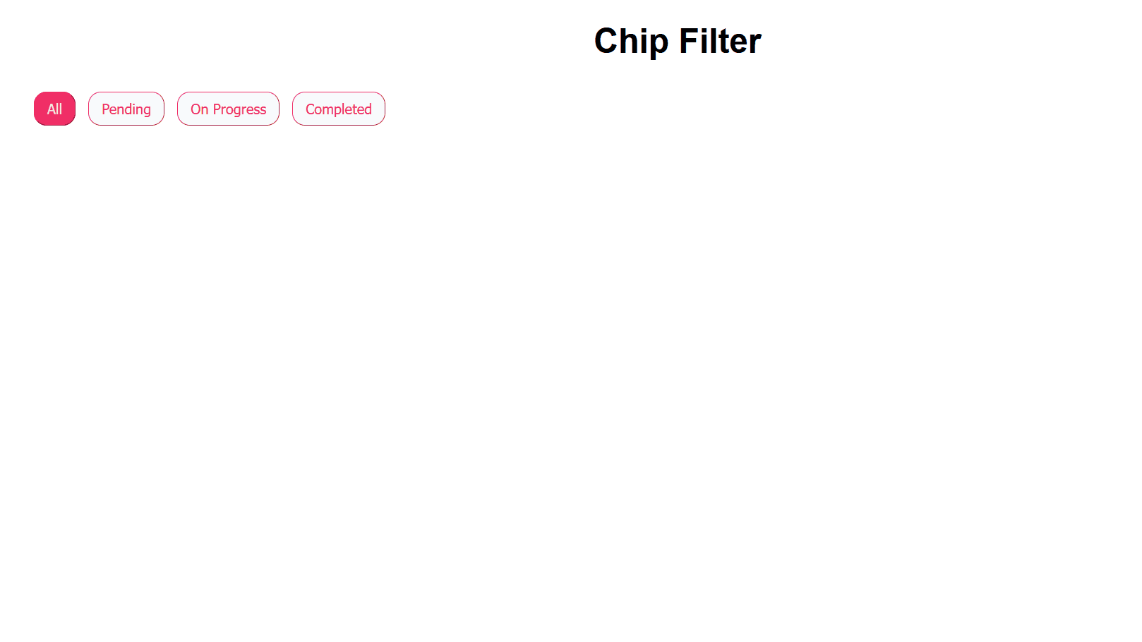
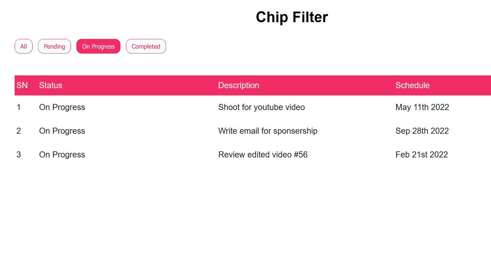
- Final result looks like this when using filter chips:
Conclusion
The chip UI component is versatile and has a lot of varieties. It makes filtering and entering information a lot more convenient and faster. More resources and specifications are available on this topic at material.io by Google.
Thanks for reading this article. Don't forget to check out my other articles. You can support this article by sharing it.