

Table of content
Card UI components can display related information in a nice and compact format. Here, we will create a reusable card for our blog website using React and CSS modules. We have divided our UI into two main components.
- Grid Component: The grid component holds multiple cards in grid format (rows and columns).
- Card Component: The card component holds information about our blog post in a concise manner.

Preparation
In the src folder of your React project, create a components folder with two folders inside: card and grid. Also create an images folder inside the public folder. Our initial folder structure looks like this:
├─ public/
│  ├─ images/
│  │  ├─ cardImage.jpg
├─ src/
│  ├─ components/
│  │  ├─ card/
│  │  ├─ cardLayout/
│  ├─ App.js
│  ├─ index.js
│  ├─ styles.css
App.js
- Below is the code for the App.js file.
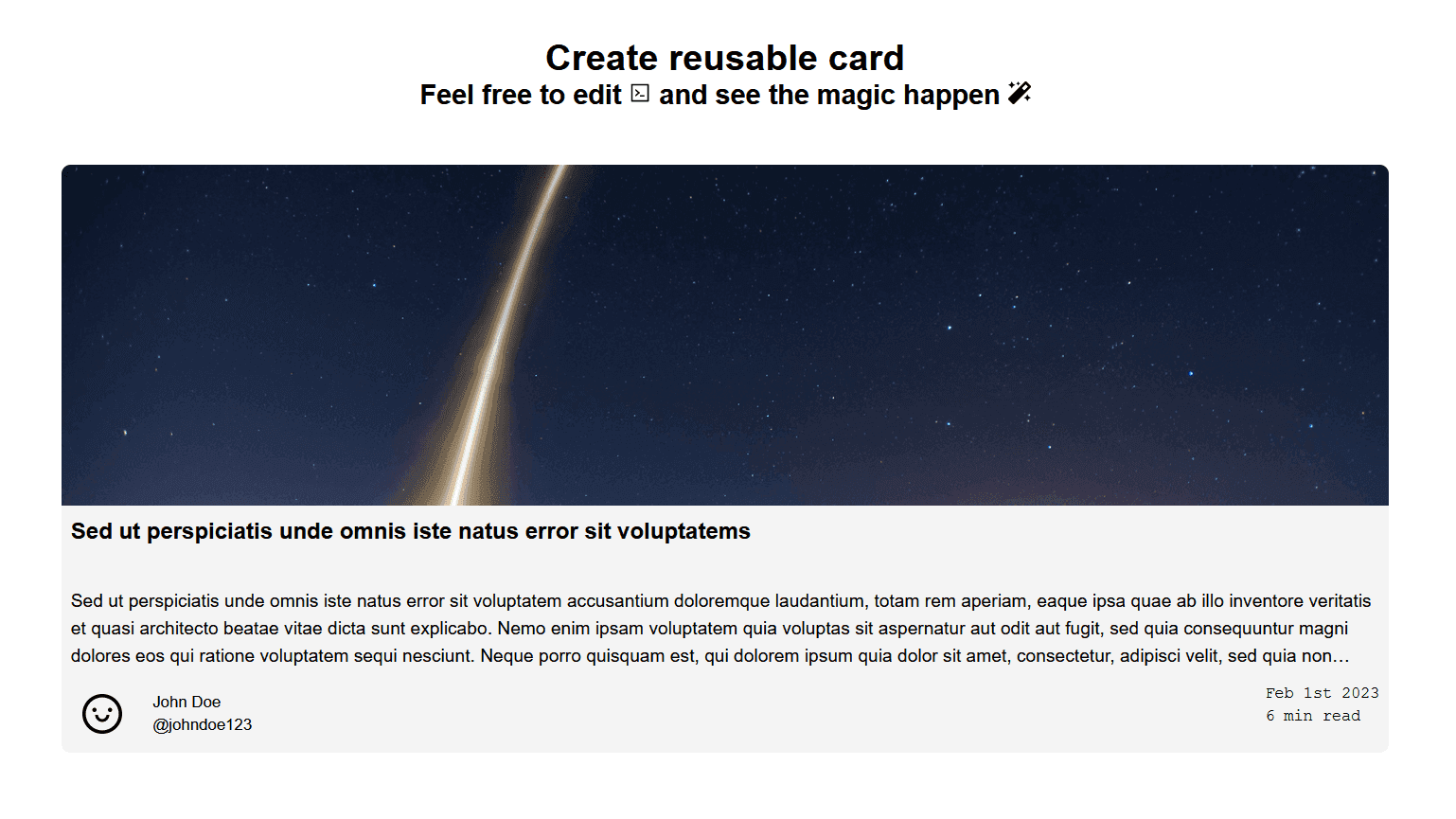
1import "./styles.css";
2import { AiOutlineCode, AiOutlineSmile } from "react-icons/ai";
3import { FaMagic } from "react-icons/fa";
4
5export default function App() {
6	const dummyData = {
7		headline: "Sed ut perspiciatis unde omnis iste natus error sit voluptatems",
8		text: "Sed ut perspiciatis unde omnis iste natus error sit voluptatem accusantium doloremque laudantium, totam rem aperiam, eaque ipsa quae ab illo inventore veritatis et quasi architecto beatae vitae dicta sunt explicabo.",
9		imageSrc: "images/cardImage.jpg",
10		btn: "btn",
11		contentUrl: "https://recodebrain.com/",
12		metaInfo: {
13			author: {
14				firstName: "John",
15				lastName: "Doe",
16				username: "johndoe123",
17				profilePicture: <AiOutlineSmile size="40" />,
18			},
19			publishedAt: "2023-02-01T08:34:05.360Z",
20			readTime: 6,
21		},
22	};
23
24	return (
25		<div className="App">
26			<div className="Heading">
27				<h1>Create reusable card</h1>
28				<h2>
29					Feel free to edit <AiOutlineCode size="20" /> and see the magic happen{" "}
30					<FaMagic size="20" style={{ verticalAlign: "center" }} />
31				</h2>
32			</div>
33		</div>
34	);
35}
Styling App.js
- Below is the code for the styles.css file.
1* {
2	box-sizing: border-box;
3	padding: 0;
4	margin: 0;
5}
6
7.App {
8	font-family: sans-serif;
9	max-width: 1200px;
10	margin: auto;
11}
12
13.Heading {
14	text-align: center;
15	padding-top: 2rem;
16	padding-bottom: 3rem;
17}
18
19a,
20a:visited {
21	color: inherit;
22	text-decoration: none;
23}
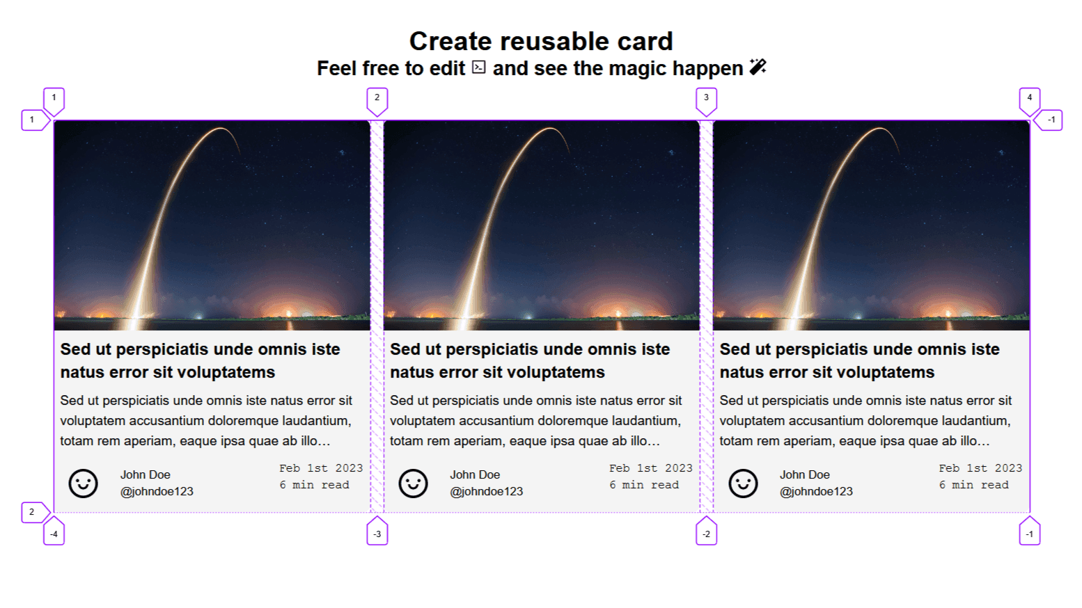
Grid Component
The grid component will hold multiple cards and arrange them in a grid format. To achieve this, we are using the display:grid in our CSS. Our Grid component will adjust its width according to the size of the parent component. It will maintain one row and multiple columns. But during overflow, it will wrap the child elements in multiple rows.
Creating the Grid Component
- Create a Grid.js file in the component/grid folder.
childrenprops will supply child components to ourGrid/parent component.- We will add the Grid.module.css styling file in the next section.
- Below is the code for Grid.js.
1import classes from "./Grid.module.css";
2
3function Grid({ children }) {
4	return <div className={classes.grid}>{children}</div>;
5}
6
7export default Grid;
Styling the Grid Component
- Create a Grid.module.css in the component/grid folder.
grid-template-columns: repeat(auto-fit, minmax(300px, 1fr));this code will create columns of equal minimum size 300px and maximum of size 1fr. Then auto fit these columns in the available parent's space. It will also handle the wrapping of children when space is not available.- Below is the code for Grid.module.css.
1.grid {
2	display: grid;
3	grid-template-columns: repeat(auto-fit, minmax(300px, 1fr));
4	grid-template-rows: 1;
5	gap: 1rem;
6	margin-left: 1rem;
7	margin-right: 1rem;
8}
Updating App.js
- In App.js, import and use the
Gridcomponent.
1import "./styles.css";
2import Grid from "./components/card/Grid";
3
4//... rest of the code
5<div className="App">
6	<div className="Heading">{/*... rest of the code*/}</div>
7	<Grid></Grid>;
8</div>;
9//...rest of the code
- See if there is any error, then move to the next section.
- Our current folder structure looks like this:
src/
├─ components/
│  ├─ card/
│  ├─ cardLayout/
│  │  ├─ CardLayout.js
│  │  ├─ CardLayout.module.css
├─ App.js
├─ index.js
├─ styles.css
Card Component
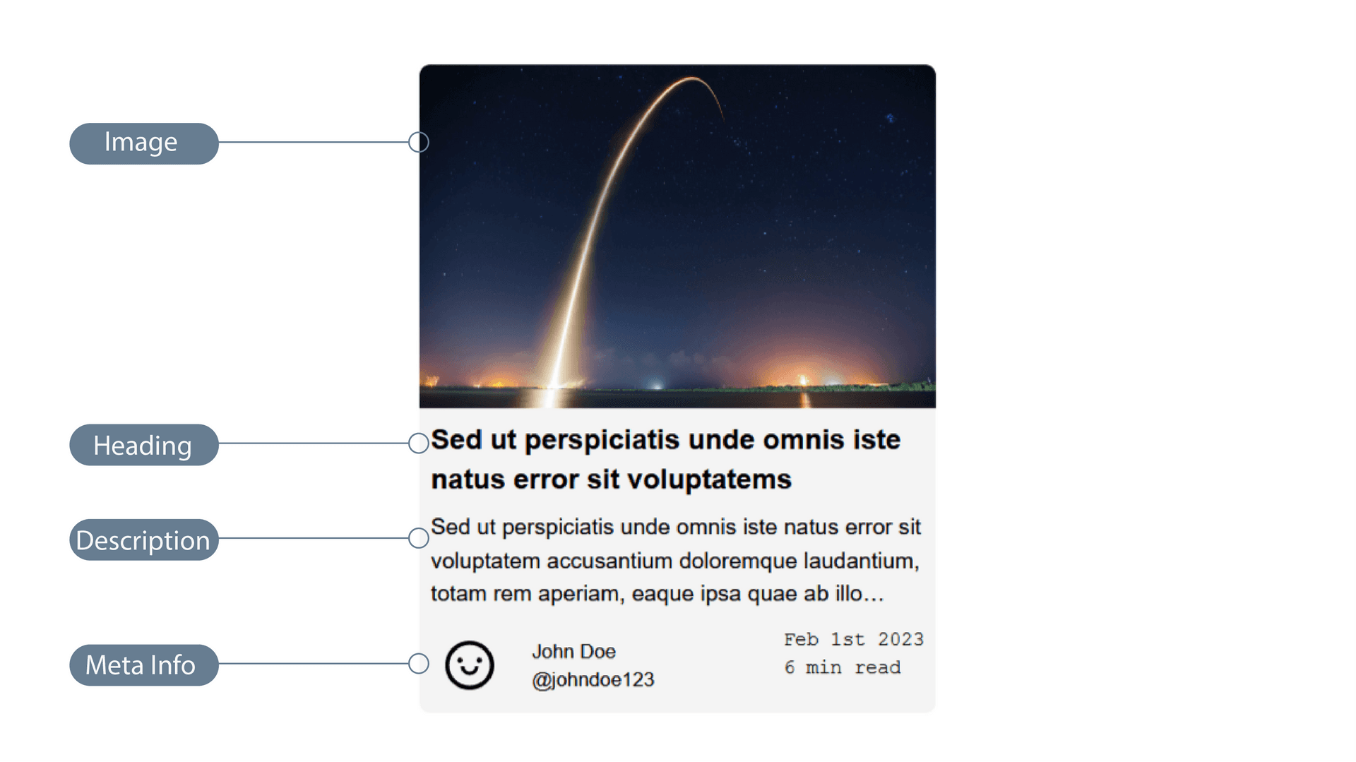
The Card will have an image, a heading, a short description, and a section for meta information in respective order.
Creating the Card Component
- Create a Card.js in the component/card folder.
- The
contentprops will supply blog information to our card component. - The
articlewill be our main container and hold all our card components. - All the components have
classNameattribute that will use the CSS module for styling. - We will create
MetaInfoas a separate component in the next section.MetaInfowill receive props from theCardcomponent. - Below is the code for Card.js.
1import classes from "./Card.module.css";
2import MetaInfo from "./MetaInfo";
3
4function Card({ content }) {
5	const { headline, text, imageSrc, metaInfo, contentUrl } = content;
6
7	return (
8		<article className={classes.cardContainer}>
9			<a href={contentUrl} target="_blank" rel="noreferrer" className={classes.imageWrapper}>
10				<img className={classes.image} alt="thumbnail" src={imageSrc} />
11			</a>
12			<div className={classes.heading}>
13				<a href={contentUrl}>{headline}</a>
14			</div>
15			<div className={classes.text}>
16				<p>{text}</p>
17			</div>
18			<>{<MetaInfo metaInfo={metaInfo} />}</>
19		</article>
20	);
21}
22
23export default Card;
Styling the Card component
- Create a Card.module.css file in the component/card folder. If you don't use the CSS module, convert it to other methods.
- Below is the code for Card.module.css.
1.cardContainer {
2	display: grid;
3	/*Sets row heights for image, heading, description, and meta-info. 4rem is the exact height for multi-line heading, and the same goes for 5.3rem.*/
4	grid-template-rows: auto 4rem 5.2rem 70px;
5	gap: 0;
6	border-width: 10px;
7	border-color: #d1d5db;
8	background-color: #f4f4f4;
9	border-radius: 0.5rem;
10}
11
12.cardContainer:hover {
13	box-shadow: 0 4px 6px -1px rgb(0 0 0 / 0.1), 0 2px 4px -2px rgb(0 0 0 / 0.1);
14}
15
16.imageWrapper {
17	/*Hides the image overflow when hovering scales up the image*/
18	overflow: hidden;
19	border-top-left-radius: 0.5rem;
20	border-top-right-radius: 0.5rem;
21}
22
23.image {
24	position: relative;
25	max-width: 100%;
26	width: 100%;
27	max-height: 300px;
28	vertical-align: bottom;
29	object-fit: cover;
30	transition-duration: 300ms;
31	transition-timing-function: cubic-bezier(0.4, 0, 1, 1);
32}
33
34.image:hover {
35	transform: scale(1.05);
36}
37
38.heading {
39	display: flex;
40	padding: 0.5rem;
41	font-size: 1.25rem;
42	line-height: 1.75rem;
43	font-weight: 600;
44	overflow: hidden;
45	display: -webkit-box;
46	/*Trims the heading to two lines with tailing dots.*/
47	-webkit-line-clamp: 2;
48	-webkit-box-orient: vertical;
49}
50
51.heading:hover {
52	-webkit-text-decoration-line: underline;
53	text-decoration-line: underline;
54}
55
56.heading.a {
57	flex: 1 1 0%;
58}
59
60.text {
61	padding: 0.5rem;
62	font-size: 1rem;
63	line-height: 1.5rem;
64	font-weight: 400;
65	/*Hides the overflow text outside of the container*/
66	overflow: hidden;
67	display: -webkit-box;
68	/*Trims the heading to three lines with tailing dots*/
69	-webkit-line-clamp: 3;
70	-webkit-box-orient: vertical;
71}
Creating the MetaInfo component
-
To make our code clean, we will create the
MetaInfocomponent separately. -
Create a MetaInfo.js file in the components/card folder.
-
Install the Day.js module for formatting dates. Install react-icons module for icons.
npm install dayjs react-icons
- Here we will have two sections: One for the profile and the other for the date and reading time.
- Below is the code for MetaInfo.js
1import dayjs from "dayjs";
2import advanceFormat from "dayjs/plugin/advancedFormat";
3
4import classes from "./MetaInfo.module.css";
5
6function MetaInfo({ metaInfo }) {
7	dayjs.extend(advanceFormat);
8	const { author, publishedAt, readTime } = metaInfo;
9	const authorName = `${author.firstName} ${author.lastName}`;
10	const publishedDate = dayjs(publishedAt).format("MMM Do YYYY");
11
12	return (
13		<div className={classes.container}>
14			// profile section
15			<div className={classes.profileContainer}>
16				<a href="#top">
17					<div className={classes.profilePicture}>{author.profilePicture}</div>
18				</a>
19				<div className={classes.authorInfo}>
20					<div>{authorName}</div>
21					<a href="#top">
22						<div>@{author.username}</div>
23					</a>
24				</div>
25			</div>
26			// time section
27			<div className={classes.timeContainer}>
28				<time>{publishedDate}</time>
29				<time>{readTime} min read</time>
30			</div>
31		</div>
32	);
33}
34
35export default MetaInfo;
Styling the MetaInfo Component
- Create a MetaInfo.module.css file in the component/card folder.
- Below is the code for MetaInfo.module.css.
1.container {
2	display: flex;
3	align-items: flex-start;
4	justify-content: space-between;
5	margin: 0.5rem;
6}
7
8.profileContainer {
9	display: flex;
10	align-items: center;
11	justify-content: flex-start;
12	flex: 1 1 0%;
13}
14
15.profilePicture {
16	position: relative;
17	display: flex;
18	align-items: center;
19	justify-content: center;
20	width: 3.5rem;
21	height: 3.5rem;
22}
23
24.authorInfo {
25	display: flex;
26	flex-direction: column;
27	padding-left: 1rem;
28	font-size: 0.875rem;
29	line-height: 1.25rem;
30}
31
32.authorInfo a:hover {
33	-webkit-text-decoration-line: underline;
34	text-decoration-line: underline;
35}
36
37.timeContainer {
38	display: flex;
39	flex-direction: column;
40	font-family: "Courier New", Courier, monospace;
41	font-size: 0.875rem;
42	line-height: 1.25rem;
43}
Note: In the above styling, the Card component takes the full width of the parent component.
Updating App.js after creating Card component
- In App.js, import and use the
Cardcomponent.
1import "./styles.css";
2import Card from "./components/card/Card";
3import Grid from "./components/card/Grid";
4
5//... rest of the code
6<div className="App">
7	<div className="Heading">{/*... rest of the code*/}</div>
8	<Grid>
9		<Card content={dummyData} />
10		<Card content={dummyData} />
11		<Card content={dummyData} />
12	</Grid>;
13//...rest of the code
- See if there is any error, then move to the next section.
- Our final folder structure looks like this:
src/
├─ components/
│  ├─ card/
│  │  ├─ Card.js
│  │  ├─ Card.module.css
│  │  ├─ MetaInfo.js
│  │  ├─ MetaInfo.module.css
│  ├─ cardLayout/
│  │  ├─ CardLayout.js
│  │  ├─ CardLayout.module.css
├─ App.js
├─ index.js
├─ styles.css
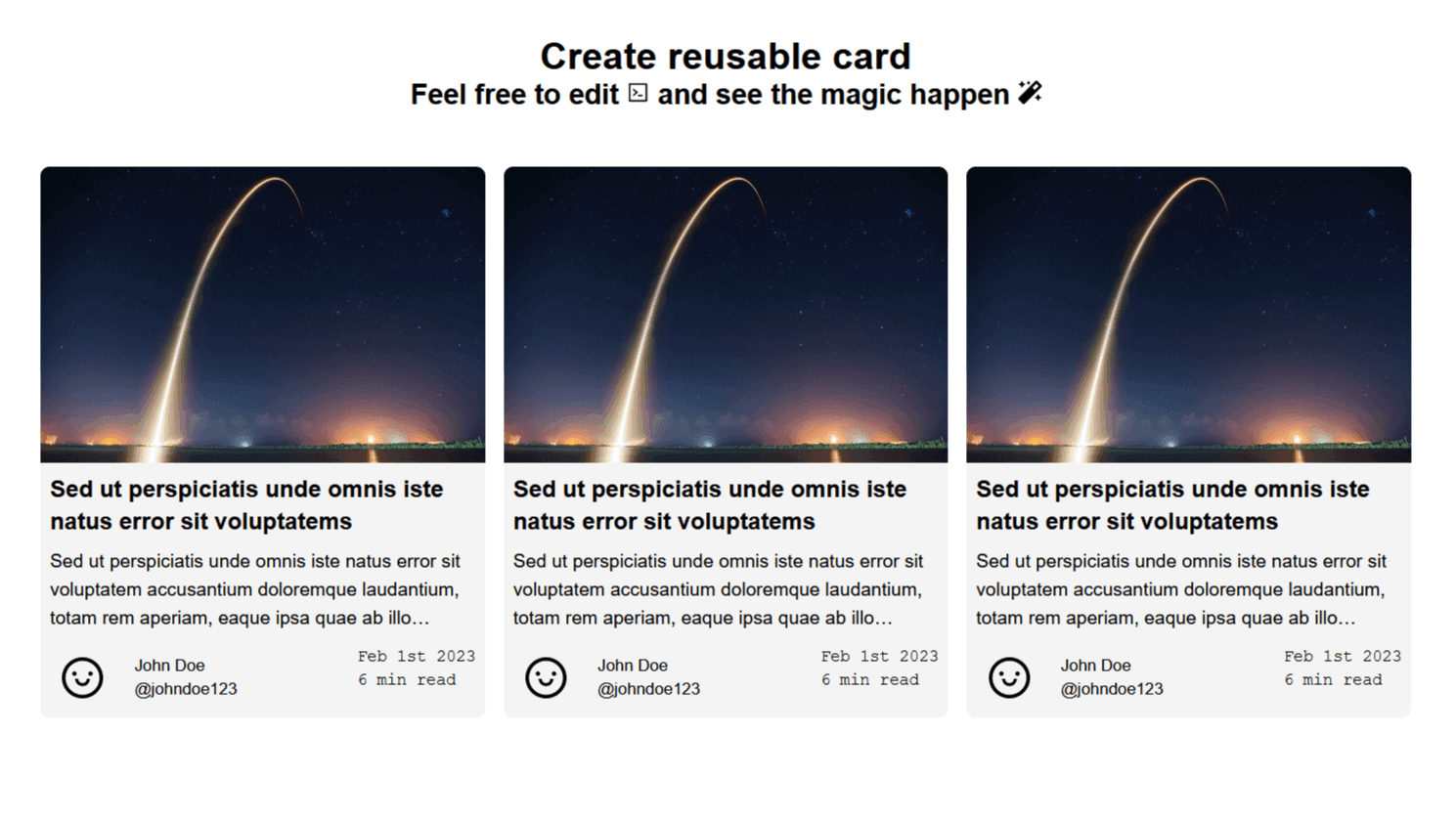
Final result looks like this:
Conclusion
A card is an easy and clean way to provide compact and concise information on any website. It can adapt to desktop and mobile views with minimum changes and styling. More resources and specifications are available on this topic at material.io by Google.
Thanks for reading this article. Don't forget to check out my other articles. You can support this article by sharing it.